How Color Schemes and Animations Guide Choices in Real-Time Interactive Betting Interfaces
Written by Sam Washington · Jun 24, 2026
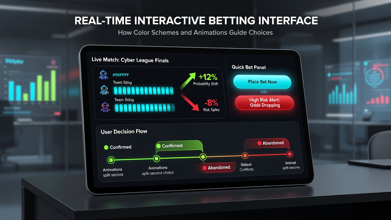
How Color Schemes and Animations Guide Choices in Real-Time Interactive Betting Interfaces
Designers working on real-time interactive betting platforms rely on color schemes and animations to shape how users navigate options and make selections during live events. These visual elements appear across mobile apps and desktop sites where odds fluctuate constantly, and platforms use specific palettes along with motion cues to highlight available bets while maintaining clarity in fast-paced environments. Color application starts with red tones for high-risk or time-sensitive wagers, which draws attention to markets that close quickly during matches. Green shades often mark favorable odds or confirmed selections because they align with established conventions in financial and gaming displays. Blue elements frequently represent neutral information such as statistical breakdowns or historical data panels. Observers note that these consistent mappings help users process information without needing to relearn layouts each time they switch between events. Animations serve a parallel role by signaling state changes in the interface. When odds update, a brief flash or pulse draws focus to the revised numbers, allowing bettors to react before the market shifts again. Progress bars that fill during bet placement provide immediate confirmation that the transaction has registered, reducing uncertainty in sequences where multiple selections occur in quick succession. Subtle transitions between screens prevent abrupt jumps that could interrupt concentration during live play.Color Psychology in Betting Decision Flow
Research from the University of Nevada Reno examined how hue saturation affects choice speed in simulated wagering tasks, and the findings revealed that moderate saturation levels produce faster decision times compared with overly bright or muted alternatives. Platforms incorporate these insights by adjusting background and accent colors based on event type, with warmer palettes dominating combat sports interfaces while cooler schemes appear in racing applications.
Users encounter these patterns repeatedly across different operators, which reinforces recognition and reduces cognitive load. Data from industry reports compiled in early 2026 shows that interfaces employing coordinated color systems recorded higher rates of completed bet sequences during peak hours, particularly in June when major tournaments overlapped with regular season events.
Animation Techniques and User Response Patterns
Developers implement micro-animations that respond to user input without overwhelming the display. A slight expansion effect on selected odds cells confirms the action while preserving visibility of surrounding markets. Countdown timers use smooth shrinking circles rather than static numbers, which maintains engagement during the final seconds before a market locks.
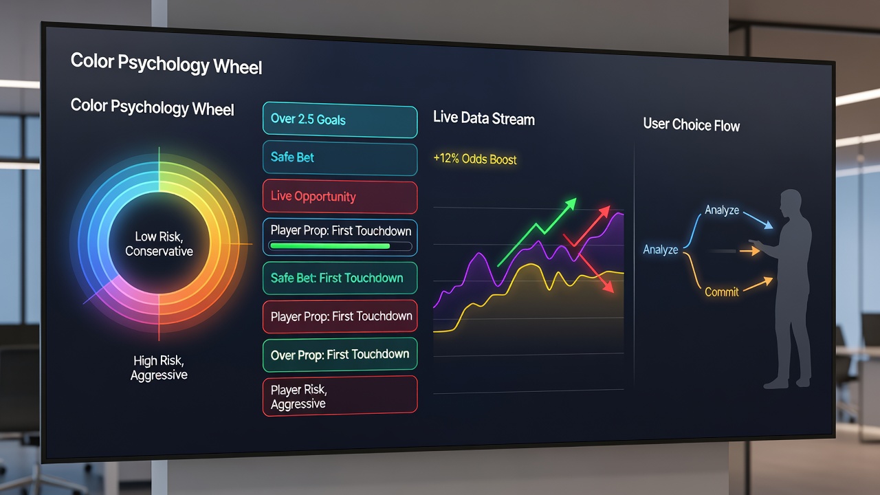
Studies conducted by the Australian Centre for Gambling Research tracked eye movement patterns and determined that controlled animations directed attention toward relevant information panels more effectively than static layouts. This guidance proves especially useful in multi-market views where dozens of options appear simultaneously on screen.
Integration Across Mobile and Desktop Environments
Real-time interfaces must adapt these visual strategies to varying screen sizes and input methods. Touch targets expand slightly during animation sequences on mobile devices, which accommodates finger placement while the color coding remains identical to desktop versions. Synchronization between platforms ensures that a user switching devices mid-event encounters the same visual language, maintaining continuity in decision processes.
Regulatory bodies in multiple jurisdictions, including the Nevada Gaming Control Board, require operators to demonstrate that interface elements do not obscure critical information such as remaining balance or betting limits. Compliance documentation from 2026 indicates that operators who documented their color and animation choices alongside accessibility testing encountered fewer review delays during certification.
Case Examples from Current Platforms
One European operator introduced a system where green gradients intensify as potential returns increase, and subsequent user logs showed elevated selection rates for those highlighted options during live tennis matches. Another platform serving North American markets applied pulsing effects exclusively to underdog odds, which correlated with shifts in betting distribution away from favorites in tracked sessions.
These implementations draw from broader UX principles documented in reports by the European Gaming Association, which emphasize that visual cues function best when they align with existing user expectations rather than introducing entirely novel patterns. Cross-platform consistency appears as a recurring theme in those analyses.
Conclusion
Color schemes and animations in real-time betting interfaces operate through established visual communication methods that support rapid information processing and selection confirmation. Data collected through academic studies and industry monitoring continues to inform refinements, while regulatory frameworks ensure these elements remain functional and transparent. As live events generate increasing volumes of market updates, the role of these design components in guiding user interactions remains central to platform functionality.